Additional Report on www.sycurio.com
Introduction
While the scope of this review is to check for accessibility errors (WCAG 2.1) it should be noted that any errors found will also impact on usability, site performance and search engines.
Language Selector
As detailed in the other reports there are lots of accessibility issues with the way the language selector has been coded. However after a long time I realised that it is only used to switch the video being played from one with an American voice to one with a British voice. If that really is the only place that the content changes then there is a much better way to do this. Relying on someone to switch the language of the site - which I doubt many would do as they would not see any benefit between the two language options - will not be very successful, especially as you are now making two web sites for google to index. Instead you should remove the language switcher and instead rely on geoip targeting to decide which set of videos to display.
Link Purpose (In Context)
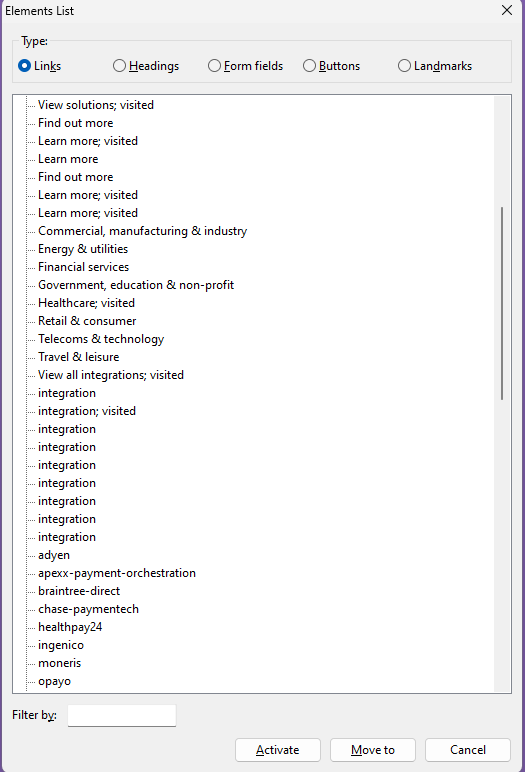
Whenever you have a link the user should be able to tell what to expect when following the link. A sighted user may be able to see that a link called “Read more” is next to some text that will give them a hint on what the link is for. A non-sighted user can not tell at all. Typically they navigate a site using assistive technology that lists the links. So a link must be both informative and unique. As can be seen in this screenshot of some of the links on the home page it is not very successful.
Glossary Page
https://sycurio.com/knowledge/glossary
Each letter in the alphabet contains a list of links. As it is a list you should use the html for a list and not use a div element and then add a list role to the div. There is no benefit to this. It could also be suggested that this is not a regular list but is a definition list and the appropriate markup for that should be used.
At the top of the page is an alphabet of letters. The obvious intent of the list is that by clicking on a letter you will be taken to the part of the list for that letter. This should be done by creating an anchor link on the name of the list by using a unique ID. However instead of that the same id is presented for every item in the list and the duplicates are visually hidden. Ouch
The designers of this page have decided that if the text is too long then they are going to blur it out by placing a layer on top of the text. For sighted users they see text that is truncated in mid-word and mid-sentence. Other users have text that can not be selected because there is an invisible image on the top. The amount of text on the page never changes but the amount of visible text varies dependent on the screen size. By making text invisible to the user google et al may consider that this is a deliberate tactic to stuff keywords on the page just for them and as a result place a penalty on the entire site
Iphone 8

Laptop
